|
Module 24 |
Updated: 07/06/2005 |
|
.
In this module we'll cover
composition guidelines 5-10, starting with Maintaining Tonal Balance 5.
The tone (brightness and darkness) of objects in a scene Once you realize that brightness influences mass, you can begin to "feel" the visual weight of objects within a scene and strive for balance. Note, for example, the tonal balance in the photo at the beginning of this module.
|
|
Balance Mass 6. Somewhat related to this is the sixth guideline: balance mass. Just as a room would seem out of balance if all of the furniture were piled up on one side, a scene must be balanced to be aesthetically pleasing. Regardless of their actual physical weight, large objects in a scene seem
heavier than small ones. By objectively viewing the elements in a scene, you
can learn to see their "perceptual weight." To do this it helps to imagine a fulcrum or balance point at the bottom
center of each of your shots. Several things can be done to try to balance
a shot: the camera can be panned to the left or right, a new camera angle can be
selected, or the lens can be zoomed in or out to include and exclude objects. Seldom
will objects actually have to be moved around. Create A Pattern of Meaning 7. The seventh guideline for effective composition is: use a combination of scenic elements to create meaning. Most people are familiar with the inkblot tests used by psychiatrists. By presenting someone with a "meaningless" collection of shapes and forms an individual draws from his or her background and thoughts and projects meaning into the abstract images. ("That looks like a father scolding his son," or "That looks like a school being crushed by a bulldozer.")
We assume that things don't just come together by accident. Good directors take advantage of this tendency and pay careful attention to the specific elements included in a scene. The most obvious example of this is the atmosphere introduction,
which we discussed earlier, where a director opens on a scene full of clues about
the central characterslong before we see them. What would be suggested by opening a dramatic production with the shot on the right? Elements in a shot may be bold and obvious, or they may be subtly designed to suggest almost subconscious meaning. Film critics have spent many hours discussing the symbolism and subconscious levels of meaning in films by directors such as Frederico Fellini. While the director of a dramatic piece should be a master at creating illusions and emotional responses, the job in ENG (electronic news gathering) and documentary work is to clearly show things the way they are and let events and facts speak for themselves. This will be covered in Module 62. However, this approach does not rule out striving for new and creative
ways to present subject matter. Often, it's only by presenting the familiar in an
entirely new way that an audience is awakened (or possibly reawakened) to its significance.
The Concrete and the Abstract Whereas in news the object is to present images as completely and clearly as possible, a shot in a dramatic production might be intended to lead viewers toward intended meaning without being totally concrete. Most intelligent viewers want a bit of room to think and interpret on their own. The phrase, "too much on the nose," is used in feature film writing to denote script dialogue or shots that have gone too far in "saying it all." This can come across to sophisticated audiences as overly simplistic. In deciding just how far to go along the abstract-to-concrete continuum videographers must know their target audience. Education is related to an ability to understand abstract ideas. This is why the classics in music, art and literature are not widely appreciated in TV and film. At the same time, considering the economic realities of the marketplace, videographersat least those who wish to be successfuldo not have the luxury of blithely going along "doing their own thing" and not concerning themselves about their specific audience. Good composition is primarily effective visual communication,
and the most effective communication takes place when a videographer understands
an audience and is able to steer the middle path between being totally concrete
and on the nose, and being so abstract that the audience misses the intended message.
Including Multiple Levels of Meaning It is possible to have it both ways? Yes, sometimes. Films and television programs can be designed to have multiple levels of meaning. Animated films such as Aladdin, The Lion King, and Shrek are examples. While the animated characters and the simple story line are entertaining children, the grown-ups pick up on the adult humor. This, of course, makes it much easier for adults to sit through these "kids" filmsand makes it more likely that they will take their kids to another such film. Most movies and television programs strive for a broad-based
appeal. If a writer (and director and editor) can "layer" a production with multiple
levels of meaning and successfully provide something for everyoneadmittedly, not
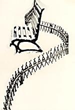
an easy task the production will have a much greater chance of success. Using Lines 8. The eighth guideline for visual composition is: make use of lines. The Our eyes tend to travel along these lines as they move from one part of the frame to another. Knowing this, it becomes the job of the videographer to use these lines to lead the attention of viewers to the parts of the frame they wish to emphasizeespecially toward the center of interest. When used in this way, lines are referred to as leading lines, because they are selected or arranged to lead the viewer's eyes into the frame, generally to the scene's center of interest. In addition to moving our eyes around the frame, lines can suggest meaning in themselves. Straight, vertical lines suggest dignity, strength, power, formality, height, and restriction.
Horizontal lines suggest stability and openness. Diagonal lines
can impart a dynamic and exciting look. Curved lines suggest grace, beauty, elegance,
movement, and sensuality. The S-curve is particularly effective in gracefully leading the eye to a center of interest. (Note the photos above and on the right.) In contrast to curved lines, sharp jagged lines connote violence
or destruction, and broken lines suggest discontinuity. Frame Central Subject Matter 9. The ninth guideline for effective composition is: frame the central subject matter.
By putting objects at one or more edges of the picture, a shot can be framed. Framing a scene holds attention within the shot and keeps viewer attention from wandering or being distracted from the center of interest. To cite a common example, a leaning tree branch at the top of
a scenic shot breaks up a bright sky and acts as a visual barrier or "stop point"
for the top of the frame. Note in the photo here how framing a shot with foreground
objects adds depth and dimension.
10. The tenth guideline is: use the effect of visual perspective to enhance or support the scene's basic idea.
In this case parallel lines will be wide apart in the foreground of the picture and will start to converge after a short distance. By creatively controlling such things as lens focal lengths and camera distance, quite different impressions about a subject can be conveyed. You may recall that there were a number of examples in Module 11. Additional
examples of composition can be |

 suggests
weight. For example, against a medium background dark objects seem heavier
than light objects. (Note the illustration here.)
 In
the same way, if a variety of objects appear in a still photo or video scene, wepossibly
even unconsciouslytry to make sense out of why they are there and what they represent.
 boundaries
of objects in a shot normally consist of lines: straight, curved, vertical, horizontal,
and diagonal.


 As noted previously, camera positions and lens focal length alter the apparent perspective
in a shot, as well as the apparent distance between objects. A minimal camera-to-subject
distance coupled with a short focal length lens (or a zoom lens at its widest position)
exaggerates perspective.