|
Module 25 |
Updated: 07/10/2005
|
|
Composition Part III
11.
A scene that is dark with many large shadow areas (a dark bedroom or a The predominance of bright or dark areas carries strong psychological meaning in itself, regardless of what else is going on. Just as the selection of lighting and monochrome values in a scene suggests mood and meaning, so does the choice of color. In general, bright colors add energy to Color preferences vary with age, sex, and race. We also know that people prefer to see colors "in their place." Magenta-to-red colors may be popular-until they are brought into a kitchen setting. A particular shade of green may be an attractive color, until it becomes associated with the walls of a hospital room. Surrounding colors also greatly affect
color preference. When a color is used near its complement its preference rating
usually rises-as long as the complementary color is subdued and is not brighter
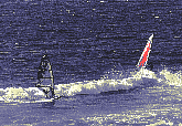
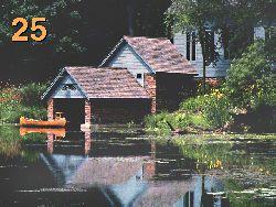
or more intense than Just as people prefer a balance between mass and tone in composition, they also prefer a balance in colors, as seen on the color wheel. In particular, they prefer a balance between calming and stimulating colors. In balancing colors in a scene be aware that it will take a larger area of cool colors to balance hot colors. Many times a videographer will want to intentionally skew this balance to achieve an intended psychological effect. For example, if a scene contains primarily cool, pastel colors such as light green, the effect on a viewer will be quite different from a scene that contains fully-saturated, hot colors, such as deep orange and burgundy. Finally, keep in mind You can draw attention to your center of interest by making it warm in color or light in tone, or both. You see the effect of this in the photo on the right.
12. The twelfth guideline for composition is: avoid mergers. There are tonal mergers, dimensional mergers, and border mergers. Tonal mergers result when important objects in a scene appear to blend together and lose their identity. This may be because of a lack of lens sharpness or because the objects are of similar tonal or color values. Can you find the butterfly in the photo on the left below?
Note how much easier it is to see the butterfly in the photo on the right.
Whenever separate elements in a scene merge together in this way you have a tonal merger.
Dimensional Mergers Next are dimensional
mergers. We've noted that the eye sees At best, dimensional mergers can cause important scene elements to run together and lose meaning; at worst, they look ludicrous, such as when a lighting fixture is jetting out of a person's-in this case, the author's-head. Although selective focus and the use of a backlight can alleviate this problem, the best solution is to recompose the shot by either shifting the camera angle or rearranging the elements. (Note that simply taking a couple steps to the left or right would have solved the problem above.)
The last type of merger, the border merger, occurs when subject matter is cut off by the edge of the frame at an inappropriate point. A side view of a car showing all but the back wheels will probably give you an uncomfortable feeling that the back end of the car is just hanging in air without any visible back support. A shot of an individual cropped at the knees also looks awkward.
Cropping off feet or hands in a shot gives a similar result. A shot of a woman in a strapless dress cropped just above the top of the dress gives the illusion she is "topless." Tightening or loosening the shot would solve the problem in each case.
13. The thirteenth guideline for effective composition is: control the number of prime objects in the scene. Generally, an odd-number of primary objects provides stronger composition than an even number.
Note on the left how the boats seem to divide the composition. When a third object is added (below), the composition improves. But when a fourth object is added, the composition again seems divided.
14. The fourteenth guideline is balance complexity and order. This aspect of composition can be stated as: complexity without order produces confusion; order without complexity produces boredom. A medium shot of a banana against a medium gray background will probably end up being a rather dull visual experience. Add a few apples, some grapes and an interesting fruit bowl, and you'll have a more engaging picture, with the banana still standing out from the darker colors. But throw in 50 randomly arranged bananas on top of this and
you'll end up with a visual muddle. Suffice it to say, the most interesting composition
is a balance between order and complexity. Movement and Meaning
Often, televised speeches are worked out with camera operators so that the camera is zoomed in to add emphasis to a certain part of the speech. With this in mind, it's generally better (psychologically) during a speech to zoom in for emphasis and then cut (rather than zoom) back, as necessary, to a medium or wide shot. Left-to-right movement is generally more engaging than right-to-left movement.
The most engrossing type of movement is diagonal, especially when it's from the lower left of the frame to the upper right. Related to this concept, a canted camera shot (a tilted camera angle, also called a Dutch angle), especially from a low angle, is often used to connote energy or power. At this point take a look at
Also see
|
 back alley at midnight) produces a far different feeling from a scene that
is brightly lit (the stage of a variety show or a beach at noon).
back alley at midnight) produces a far different feeling from a scene that
is brightly lit (the stage of a variety show or a beach at noon).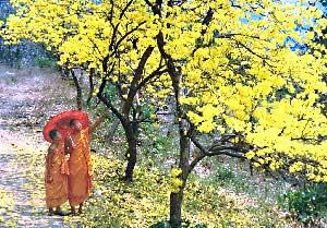 composition,
while lighter hues impart a serene, harmonious, and stable look.
composition,
while lighter hues impart a serene, harmonious, and stable look. 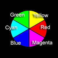 the original color. (Recall that complementary colors are opposite each other
on the color wheel.)
the original color. (Recall that complementary colors are opposite each other
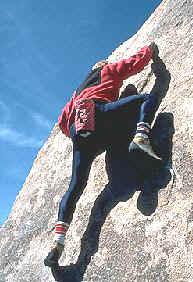
on the color wheel.) that our eyes initially tend to be drawn to the "warmer" areas of a picture. So,
all things being equal, things that are yellow, red, and orange will be noticed
before those that are blue, green or purple.
that our eyes initially tend to be drawn to the "warmer" areas of a picture. So,
all things being equal, things that are yellow, red, and orange will be noticed
before those that are blue, green or purple.

 On the left we see a common example of dark hair blending into a dark background.
As we will see in the next section on lighting, a back light or a background light
would separate the child's hair from the background.
On the left we see a common example of dark hair blending into a dark background.
As we will see in the next section on lighting, a back light or a background light
would separate the child's hair from the background. selectively
and in three dimensions. By closing one eye a videographer can often get a better
idea of how a scene will appear when the third dimension is removed.
selectively
and in three dimensions. By closing one eye a videographer can often get a better
idea of how a scene will appear when the third dimension is removed.